Section 3.3 Two-variable Visualizations
Preview Activity 3.3.1.
By hand, sketch the \(xy\) coordinates in the following table as points on a coordinate plane.
| \(x\) | \(y\) |
| 1 | 10 |
| 2 | 9 |
| 3 | 7 |
| 5 | 4 |
| 6 | 6 |
| 6 | 4 |
| 7 | 3 |
Suppose \(x\) measures for the number of days a student has been absent from class, and \(y\) represents their score on a quiz out of \(10\text{.}\) What conclusion might you draw from the table of data? How do the points you drew in the coordinate plane illustrate this conclusion? Write a sentence or two summarizing your thoughts.
Activity 3.3.2.
Often data scientists need to consider data where each item has two properties. When one property is a category, and the other is numerical, a bar chart is often the right tool for the job.
(a)
Repeat the steps from previous sections to get a copy of pizza_table available for this notebook.
(b)
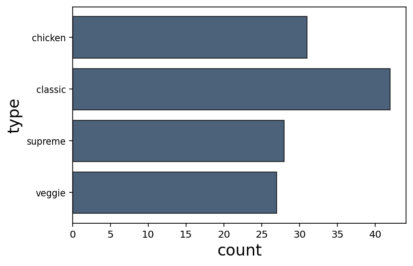
The table in 3.3.2 describes how many pizzas of each type (Chicken, Classic, Supreme, Veggie) were sold on June 20th.
| Type | Count |
| Chicken | 31 |
| Classic | 42 |
| Supreme | 28 |
| Veggie | 27 |
This table was created by running june20_pizzas = pizza_table.where("date","2015-06-20").group("type") and june20_pizzas.show(). Modify this code to create the table may18 for May 18th instead, and show the result.
(c)
The bar chart in 3.3.3 visualizes the amounts of each pizza type sold on June 20. Each category (in this case, the type of pizza) is listed on the vertical axis, and the size of the bar in the horizontal direction represents each numerical value.
Create a similar bar chart by hand for the May 18th table you displayed in the previous task.
(d)
The Python datascience library can produce bar charts; the code june20_pizzas.barh("types") was used to produce 3.3.3. Adapt this line of code to generate a bar chart for the May 18th data instead. (Note: you'll need to run import matplotlib and %matplotlib inline first to display any visualizations.)
(e)
The code pizza_table.where("date","2015-06-20").select("type","price").group("type",sum) captures the total sales for each type of pizza sold on June 20th.
Generate a bar chart visualizing the total sales for each type of pizza sold on May 18th.
Activity 3.3.3.
The line chart is a useful tool to visualize how data changes over time.
(a)
Right now, the date for each pizza sold is stored as a string of numbers and hyphens, such as "2015-08-19". The code in 3.3.4 provides a datetime column with values that Python understands better. (This is another example of “cleaning” data for analysis.)
# converts `date` string into a native datetime format
from datetime import datetime
pizza_table = pizza_table.with_column("datetime",pizza_table.apply(
    lambda x:datetime.strptime(x,"%Y-%m-%d"),"date"
))
datetime valuesUse this script to update your pizza_table. Show twenty rows of the resulting table below to confirm that it has both a date column (which stores strings) and a datetime column (which stores datetimes).
(b)
The code in 3.3.5 displays the total number of pizzas sold each day of 2015 as the line chart given in 3.3.6.
# .plot("datetime") creates a line chart with the datetime column on the
# horizontal axis, and other numerical columns on the vertical axis
pizza_table.select("datetime","price").group("datetime").plot("datetime")
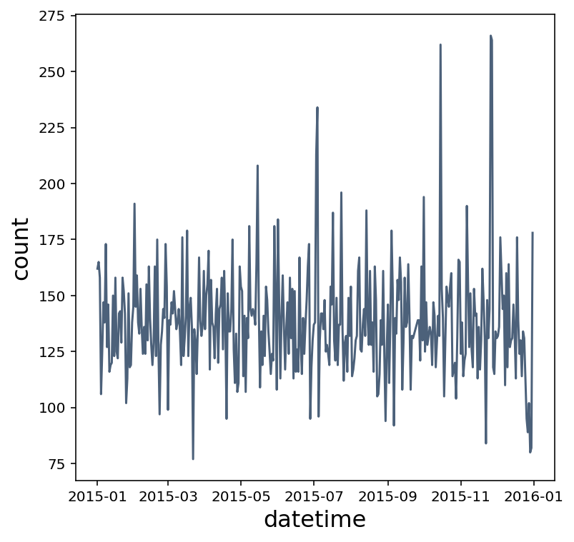
Write a sentence describing the approximate time of year when the pizza parlor's best day of sales occurred, and how you determined this from the line chart.
(c)
Copy 3.3.5 into a new Code cell, but modify .group("datetime") so that instead of showing the number of pizzas sold each day, the total (sum) of sales for each day are shown in the line chart instead.
Activity 3.3.4.
Scatter plots are often used to compare two numerical values throughout a dataset to determine if they have a relationship.
(a)
Create a table called testing_table populated with the “Math Placement Exam Results” dataset found at https://vincentarelbundock.github.io/Rdatasets/datasets.html. This dataset describes the mathematics testing results from several freshmen students at a liberal arts college, including SAT, ACT, and the college's internal math placement exam results.
Show the first ten rows of this table.
(b)
You'll see many “Not a Number” nan values in this table for when data was not available. To clean this data for analysis, you should remove these records as needed by only using values that are positive.
Use from datascience.predicates import are and .where(column_name,are.above(0)) to, show the first ten rows of this table that don't have a nan score for SAT math scores.
(c)
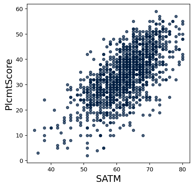
The script in 3.3.7 results in a scatter plot. Each dot represents a different student's SAT Math score (by its horizontal position) with their college math placement score (by its vertical position). Note that scores of nan and other non-positive results are ignored.
# The backslash can be used to continue a long line on multiple lines
testing_table.where("PlcmtScore",are.above(0)).where("SATM",are.above(0)) \
    .select("SATM","PlcmtScore").scatter("SATM")
Run a modified copy of this script in a Code cell to display a scatter plot that compares ACT Math scores with college math placement scores.
(d)
When two values of data are correlated (that is, possibly influenced by one another), this correlation is often apparent when visualized in a scatter plot.
Do you think SAT Math scores and correlated with this college's math placement exam results? What about ACT Math scores? Write a few sentences explaining why or why not.
(e)
Suppose you heard someone claim that this college's math placement score doesn't measure mathematical ability, but instead only reflects the size of each student's high school.
Show a scatter plot comparing the size of each student's high school with their math placement score. Then write a sentence or two explaining whether you agree with this claim or not, based on the scatter plot.
(f)
Suppose you heard someone claim that students shouldn't have to take a math placement test once they come to this college, and SAT or ACT socres should be used instead. Based on the scatter plots above, would you agree or disagree with that statement? Write a few sentences explaining your reasoning.
Exercises Exercises
1.
Get copies of pizza_table and testing_table available in this notebook. Show the first ten rows of each.
2.
Show a table counting how many pizzas of each name (BBQ Chicken, Five Cheese, etc.) were sold on February 28th.
3.
Show a bar chart visualizing how many pizzas of each name were sold on February 28th. (Don't forget import matplotlib and %matplotlib inline.)
4.
What two named pizzas were most popular on February 28th? Write a sentence or two explaining why the bar chart was better or worse than the table at communicating this fact.
5.
Display a line chart visualizing the number of Spinach Fettuccine pizzas sold each day at this pizzeria. (Don't forget to use a datetime column for displaying dates.)
6.
On what day (roughly) was Spinach Fettuccine most popular? How many were sold? How does the line chart communicate this fact more clearly than a data table?
7.
Show a scatter plot comparing adjusted GPA records to the testing_table college's math placement exam.
8.
Suppose someone claimed that adjusted GPAs should be used to determine what math course each student takes in college. Give at least one reason to agree, and at least one reason to disagree. Be sure to include the scatter plot in your argument.