Section 3.2 Single-Variable Visualizations
Preview Activity 3.2.1.
In 2015, the Pew Research Center conducted a survey on “Gaming and Gamers”, and published their results at https://www.pewresearch.org/internet/2015/12/15/gaming-and-gamers/. Some of this data has been summarized by the textbook author in 3.2.1.
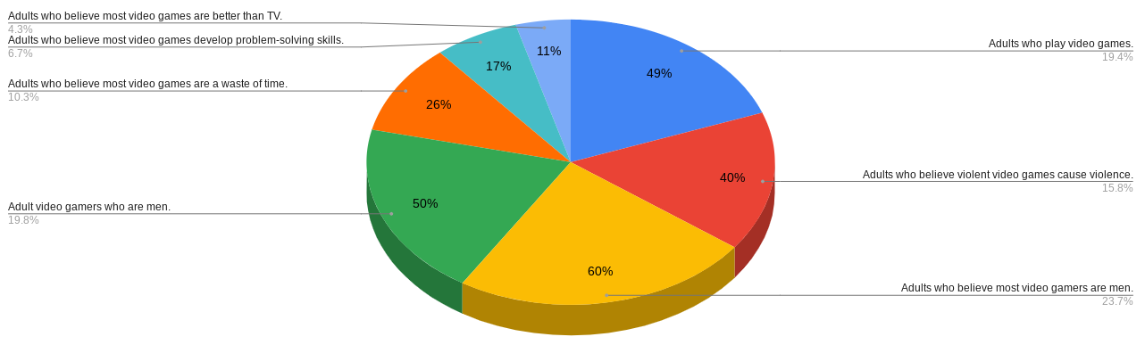
All the data in the figure given is correct. Nonetheless, what do you notice about how these data have been visualized? What do you wonder? Write a few sentences summarizing your thoughts in a Markdown cell.
Activity 3.2.2.
Choosing the right graphical visualization for your data depends on the kind of data you wish to display. Univariate data only considers a collection of numbers each representing a certain quantity, for example, the prices of pizzas sold from the dataset studied in 3.1. The prices of the first twenty pizzas sold (truncated down to full-dollar amounts) on January 1st are shown in 3.2.2.
| 13 | 16 | 16 | 20 | 18 |
| 20 | 20 | 16 | 16 | 16 |
| 12 | 12 | 12 | 12 | 20 |
| 12 | 20 | 20 | 20 | 12 |
(a)
To quickly visualize a small dataset by hand, a dot plot may be drawn. Values of the dataset are represented on the horizontal axis, and each time the value appears in the dataset, an additional dot is drawn above the value. A dot plot representing the prices in 3.2.2 is shown in 3.2.3.
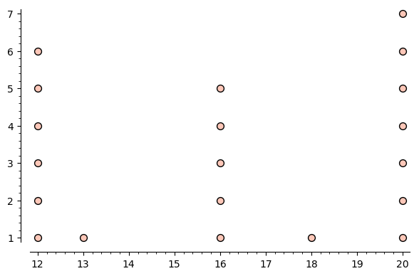
A dot plot allows the reader to quickly scan a dataset and learn information about it. For example, what two prices were the most common out of the twenty pizzas sold? How do you know?
(b)
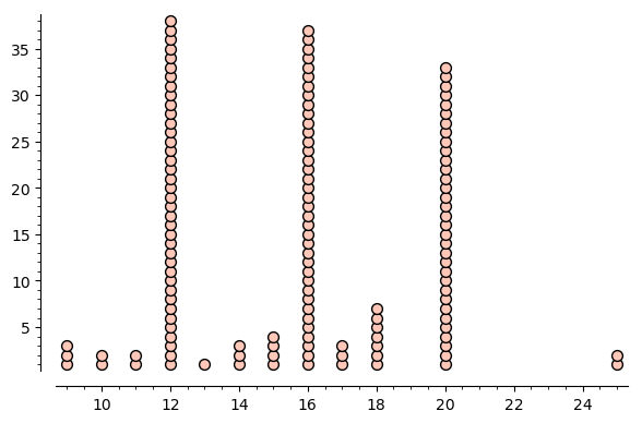
The major feature of dot plots is that they are easy to draw by hand. On a sheet of paper or using a simple graphics program, draw a dot plot representing the prices of the first twenty pizzas sold on November 3rd, shown in 3.2.4.
| 20 | 20 | 20 | 16 | 20 |
| 20 | 11 | 12 | 16 | 10 |
| 20 | 16 | 20 | 12 | 20 |
| 12 | 12 | 11 | 20 | 16 |
(c)
What was the most common pizza price out of the first twenty sold on November 3rd? What was the least common price?
(d)
A dot plot representing the prices (truncated down to the nearest dollar) of all pizzas sold on April 1st is shown in 3.2.5. Is this a graphic you'd like to draw by hand? Is this a useful graphic to create by computer? Write a couple sentences summarizing your thoughts.
Activity 3.2.3.
The datascience library supports quickly generating histograms visualizing univariate data. Histograms are similar to dot plots, but measure how many values fall within a range rather than individual values.
(a)
Repeat the steps from 3.1 to make pizza_table available in this Jupyter notebook.
Confirm by running the code in 3.2.6 to create a histogram of prices for April 1st.
# The following two lines only need to be run once per notebook
# that generates datascience graphics
import matplotlib
%matplotlib inline

# Generate histogram for April 1st
# (Always leave normed=False to measure counts of data values)
pizza_table.where("date","2015-04-01").select("price").hist(bins=20,normed=False)
(b)
Each bin or bar of the histogram counts how many prices fall within the range shown along its base (including the left endpoint but excluding the right endpoint). For example, seven pizzas were sold at a price of around $19.
How many pizzas sold on April 1st had a price roughly between $12 and $13?
(c)
Compare the result of 3.2.6 to 3.2.5. What do they have in common? How do they differ? What might explain these differences? Write a few sentences summarizing your thoughts.
(d)
Generate a histogram of pizza prices sold on June 19th, grouped into 15 bins.
(e)
Run the code pizza_table.select("size","price").hist(group="size",bins=20,normed=False). Write a few sentences summarizing what this graphic illustrates about the dataset.
(f)
Create a useful visualization of the prices of pizzas sold at this restaurant throughout 2015, based on their type (supreme, veggie, classic, etc.).
(g)
Write a sentence or two making an observation about the pizzas sold in 2015, based upon the graphic you created in the previous task.
Activity 3.2.4.
While a histogram is a useful summary of a univariate dataset, this data can often be further summarized by the use of a box plot, also known as a box-and-whisker plot.
A box plot organizes numerical data into four parts, each illustrating (roughly) a quarter of all the data values: the left whisker, the left box half, the right box half, and the right whisker. (We will explore these ranges in more detail in 4.)
# First code cell
print("Oct 09 Pizza Prices")
pizza_table.where("date","2015-10-09").select("price").hist(normed=False)
pizza_table.where("date","2015-10-09").select("price").boxplot(vert=False)

# Second code cell
print("Oct 10 Pizza Prices")
pizza_table.where("date","2015-10-10").select("price").hist(normed=False)
pizza_table.where("date","2015-10-10").select("price").boxplot(vert=False)
(a)
Run the first half of the code found in 3.2.7 to compare a histogram to a box plot. Write a few sentences comparing how the data is presented in each graphic.
(b)
Run the second half of the code found in 3.2.7 to compare another histogram to a box plot. What do you notice about this second box plot that wasn't in the first? What do you expect this feature represents?
Exercises Exercises
1.
Repeat the necesary steps from the class activities in order to make pizza_table available for these exercises. Then run pizza_table.show(10) to confirm.
2.
Display a table with the thirty-four veggie pizzas sold on May 6th.
3.
Summarize the prices in the previous table by drawing a dot plot on a sheet of paper or using a simple graphics program. Consider the prices in dollar amounts (ignoring cents).
4.
Summarize the prices in the previous table by using a Code cell to generate a histogram that uses ten bins. (Tip: Don't forget the two matplotlib lines.)
5.
Generate a box plot for the prices in the previous exercise.
6.
Describe the similarities between your dot plot, histogram, and box plot. Then explain their differences.
7.
Display a histogram of the prices of all large pizzas sold in 2015, grouped by type.
8.
Make an observation about the prices of large pizzas based upon the graphic in the previous exercise.