Section 5.1 Measuring Correlation
Preview Activity 5.1.1.
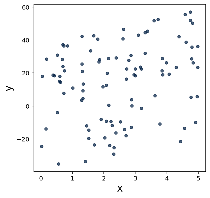
Consider the following scatter plots comparing college math placement exam scores to SAT math exam scores and the size of each student's high school.
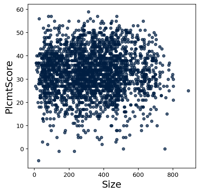
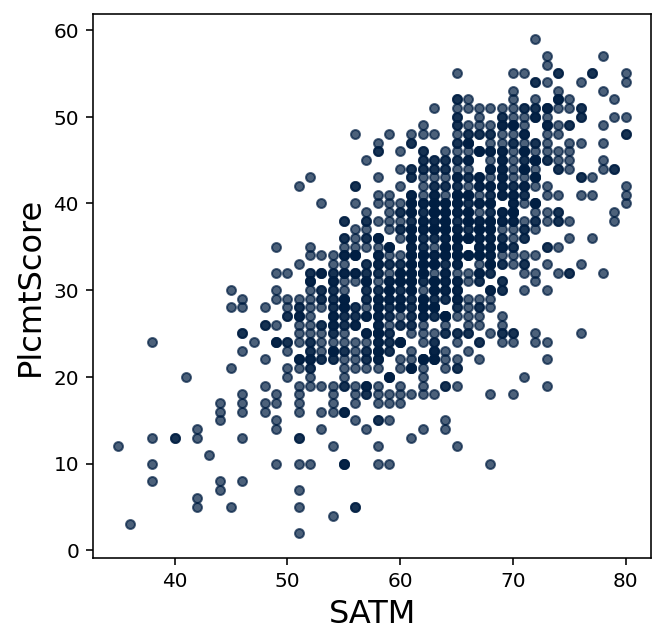
Historically, the college placed students who recieved higher placement exam scores into more advanced math courses. But suppose this college decided to save money and time by no longer offering a math placement exam.
(a)
Should the college place students who come from larger schools into more advanced math courses? Write a few sentences on why you agree or disagree, based on both the scatter plot and your intuition.
(b)
Should the college place students who scored higher on the math SAT into more advanced math courses? Write a few sentences on why you agree or disagree, based on both the scatter plot and your intuition.
Activity 5.1.2.
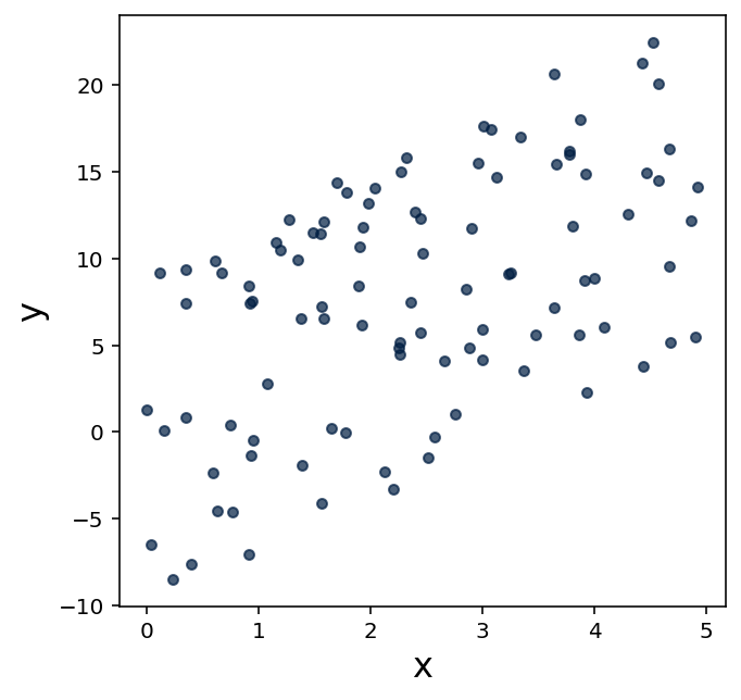
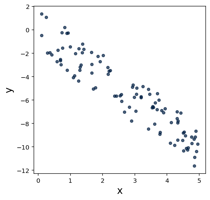
When pairs of data values tend to fall along a line, that data is said to be linearly correlated. The correlation coefficient of these pairs of values is a number between \(-1\) and \(1\) that describes the strength of this correlation, known briefly as \(r\text{.}\)
A value of \(r=1\) means that the points of data fall exactly along an upward line, that is, one value tends to increase as the other value increases. On the other hand, \(r=-1\) means that the points of data fall exactly along a downward line, that is, one value tends to increase as the otehr value decreases. A value of \(r=0\) means there's no recognizable linear relationship between the pairs of data values.
However, most real datasets will have a fractional \(r\) value. Nonetheless, the closer this value is to \(1\) or \(-1\text{,}\) the stronger the correlation, while the closer this value is to \(0\text{,}\) the weaker the correlation. This is illustrated in 5.1.3 (obtained from Wikipedia 1 ).

The mathematics used to compute \(r\) are outside the scope of this course, so we will focus on understanding what \(r\) communicates about a dataset and how to compute \(r\) using technology.
(a)
Unfortunately, the datascience library doesn't provide a great out-of-the-box mechanism for computing \(r\text{.}\) Fortunately, we can add two features to our datascience tables by copy-pasting the snippet given in 5.1.4 into a Code cell. (This will need to be done in every notebook that uses these features.)
def with_correlated_columns(self,num_rows=100,x_range=5,slope=1,noise=1):
    from random import random
    table = self.select().with_columns("x",[],"y",[])
    for _ in range(num_rows):
        seed = random()
        x = seed*x_range
        y = seed*x_range*slope
        y = y + (-1+2*random())*noise
        table = table.with_row([x,y])
    return table
def correlation(self,col1_name,col2_name):
    import statistics
    # get column arrays
    col1 = self.column(col1_name)
    col2 = self.column(col2_name)
    # standardize units
    col1_s = (col1 - statistics.mean(col1))/statistics.stdev(col1)
    col2_s = (col2 - statistics.mean(col2))/statistics.stdev(col2)
    # correlation is the mean product of standard units
    return statistics.mean(col1_s*col2_s)
setattr(Table,"with_correlated_columns",with_correlated_columns)
setattr(Table,"correlation",correlation)
datascienceWhile we won't go into detail on how correlation is measured, it is related to the measures of center and spread studied in the previous chapter. Inspect the code shown in 5.1.4; what measure of center and what measure of spread appear to be used to compute correlation?
(b)
When 5.1.4 is run successfully, no output will be shown. However, you should now be able to create a table by running ctable = Table().with_correlated_columns(). (Note that this table is generated somewhat randomly, so re-running that line will create a slightly different table.)
Show ten rows and a scatter plot for this ctable.
(c)
Based on the definition of the correlation coefficient \(r\) and the illustration given in 5.1.3, would you expect the correlation of these pairs of data to be closer to \(-1\text{,}\) \(0\text{,}\) or \(1\text{?}\)
(d)
Run ctable.correlation("x","y") to confirm your intuition.
(e)
Show a scatter plot for ctable2 = Table().with_correlated_columns(slope=3). Guess a value for r based on the scatter plot, and then confirm your guess using technology.
(f)
Show a scatter plot for ctable3 = Table().with_correlated_columns(x_range=10,slope=-2). Guess a value for r based on the scatter plot, and then confirm your guess using technology.
(g)
Show a scatter plot for ctable4 = Table().with_correlated_columns(noise=5,slope=2). Guess a value for r based on the scatter plot, and then confirm your guess using technology.
(h)
Show a scatter plot for ctable5 = Table().with_correlated_columns(noise=100,slope=-4). Guess a value for r based on the scatter plot, and then confirm your guess using technology.
Activity 5.1.3.
It's important to remember that \(r\) measures linear correlation.
(a)
Display a scatter plot visualizing the table generated by the code given in 5.1.5.
cos_table = Table(["x","y"])
for _ in range(200):
    from random import random
    from math import cos
    seed = random()
    cos_table = cos_table.with_row([seed,cos(12.6*seed)])
(b)
Based on the definition of the correlation coefficient \(r\) and the illustration given in 5.1.3, would you expect the correlation of these pairs of data to be closer to \(-1\text{,}\) \(0\text{,}\) or \(1\text{?}\)
(c)
Confirm your guess using technology.
(d)
Regardless of the value of \(r\text{,}\) give one or more reasons based on the scatter plot for why it'd be fair to say that these data points are “related”.
In general, why might data be related even when \(r\) is close to zero?
Activity 5.1.4.
Let's return to the question of math placement scores discussed in 5.1.1.
(a)
Get a copy of testing_table from 4.3 available for use in this notebook, and use code cells to produce the scatter plots shown in 5.1.1 and 5.1.2.
Don't forget to use import matplotlib, %matplotlib inline, and .where("column_name",are.above(0)) appropriately.
(b)
Describe your intuition for why SAT math scores, college math placement exam scores, and high school sizes may or may not be correlated with each other based upon the scatter plots.
(c)
Test your intuition by using technology to compute appropriate correlation coefficients. Explain why those values confirm or contradict your intuition.
(d)
Is it true to say that SAT math scores are perfect predictors of college math placement exam scores? Give reasons why or why not based upon the scatter plot, the value of \(r\) found, and your intuition.
Exercises Exercises
1.
What does it mean when a collection of data pairs has a correlation coefficient \(r\) close to \(1\text{?}\)
2.
What does it mean when a collection of data pairs has a correlation coefficient \(r\) close to \(-1\text{?}\)
3.
Does a correlation coefficient \(r\) close to \(0\) mean that the pairs of values have no relationship at all? Describe an example from class that supports your answer.
4.
For each of the following three scatter plots, estimate the value for the correlation coefficient, and explain why you chose your estimation.
5.
Get a copy of testing_table available in this notebook, as well as the correlation computational features given in 5.1.4.
Compute the correlation coefficient between SAT math exam scores and ACT math exam scores.
6.
Write a sentence explaining what this correlation coefficient describes about SAT and ACT math exam scores.
7.
Show a scatter plot comparing SAT and ACT math exam scores. Explain how the scatter plot illustrates the correlation you found numerically.
https://en.wikipedia.org/wiki/Pearson_correlation_coefficient