Section 5.2 The Fit Line
Preview Activity 5.2.1.
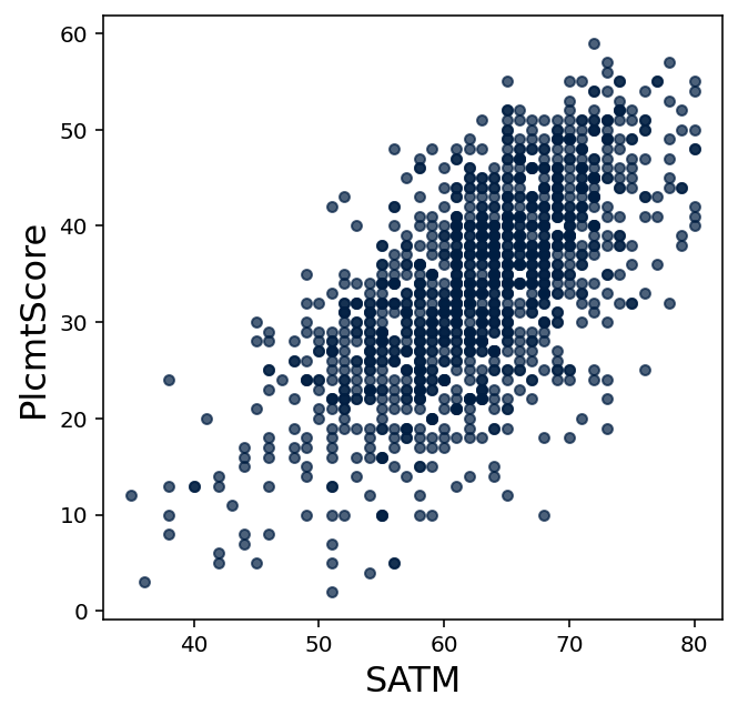
Consider the following scatter plot of math placement exam scores to SAT math exam scores.
(a)
What were the maximum and minimum placement scores earned by students who scored 60 on the SAT math exam?
(b)
Suppose a student was unable to take the placement exam, but scored 60 on the SAT math exam? What would be a “fair” placement exam score to assign to that student based upon this data?
Activity 5.2.2.
When a scatter plot indicates a linear relationship, a regression line or fit line is often added to the plot to illustrate this linear behavior.
(a)
Add the with_correlated_columns and correlation features from the previous section to this notebook.
(b)
Create three tables with correlated columns: clean_table, noisy_table, and noisiest_table. Let all tables have a slope of \(3\text{,}\) but set the noise values as \(1,10,30\) respectively.
Display their scatter plots below, and compute the correlation for each table.
(c)
Display their scatter plots again, but this time use .scatter("x",fit_line=True) to display the fit line for each plot.
(d)
Write some observations about the slopes of each fit line (the vertical rise divided by horizontal run), the how the data is spread out from each fit line, the correlation coefficients you found, and how you generated these datasets. (Be sure to look at the vertical axis of each plot, since each plot scales this axis differently.)
(e)
Describe the general rule that describes the relationship between the correlation coefficient \(r\) and when a fit line appears to accurately describe the behavior of data.
(f)
Generate a scatter plot for correlated columns with a noise of \(2\) and a slope of \(-5\text{.}\) Show its fit line, and compute its correlation coefficient.
(g)
Does this demonstrate how the rule you made above should be fixed? If so, fix it to account for this new example.
Activity 5.2.3.
When appropriate, a fit line based on sample data can be used to predict the value of unsampled data.
(a)
Get a copy of testing_table from 4.3 available for use in this notebook, and use code cells to produce the scatter plot shown in 5.2.1.
Don't forget to use import matplotlib, %matplotlib inline, and .where("column_name",are.above(0)) appropriately.
(b)
Add a fit line to this plot.
(c)
This table has historical data for a full range of SAT scores. But what if historical data only existed for SAT math scores of 60 or greater? Emulate this by showing a scatter plot with a fit line that only considers records with an SAT math score that are.above(60).
(d)
If you were to extend this fit line left to where an SAT math score of \(40\) would go, about what score for the math placement score would the fit line predict?
(e)
How does this compare to the actual data?
Exercises Exercises
1.
Add the with_correlated_columns and correlation features from the previous section to this notebook.
Generate table_a with correlated columns where noise=2, and table_b with correlated columns where noise=20. Show the first few rows of each table.
2.
Display scatter plots with fit lines for table_a and table_b.
3.
Use the scatter plots and fit lines to estimate the correlation coefficient \(r\) for each table without using technology. Explain how the scatter plots and fit lines assisted with your estimation.
4.
Use technology to compute \(r\) for each table.
5.
Suppose these tables represented actual collected data (rather than being generated by a computer). Based on your work in these exercises, which set of data could you more confidently make predictions from? Why?
6.
Predict the value of y for a data point where x=7 for this table.